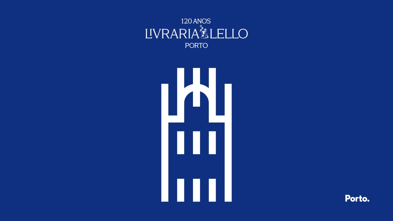
Livraria Lello's icon joins Porto.'s mesh

In the year it celebrates its 120th anniversary, Livraria Lello presents its rebranding and takes on the name Livraria Lello Porto, explicitly affirming its connection to the city where it was born in 1906.
More than just a change of name or visual identity, this repositioning represents a cultural stance. As Agustina Bessa-Luís wrote, ‘Porto is a feeling’ — a feeling made up of independence, forthrightness and independent thinking, values that have always defined Livraria Lello.
Taking on the name of the city is to make the essential visible: a way of being marked by intellectual non-conformity, cultural independence and respect for memory, without fear of the future. The rebranding also translates into the adoption of blue as the identity colour and the creation of the Livraria Lello Porto Icon, a graphic sign of belonging and character.
The icon is part of the visual fabric of the city of Porto, developed by Eduardo Aires, and is donated to the Municipality of Porto as a gesture of commitment to a city that values culture as critical thinking.
The Livraria Lello Porto rebranding affirms a simple idea: culture is born of non-conformity.
Porto is one of those cities. So is Livraria Lello Porto.
More about the donation of the icon:
In the context of the celebrations of the 120th anniversary of Livraria Lello, the city of Porto and the bookshop are deepening a historical relationship that transcends geography to assert itself as a shared identity.
The donation of the Livraria Lello Porto Icon to the Municipality of Porto is part of this gesture of reciprocity: the bookshop is giving back to the city a symbol that has been collectively built over more than a century — by readers, writers, publishers, architects and citizens.
This icon thus becomes part of the city's visual fabric, developed by Studio Eduardo Aires, affirming Livraria Lello not only as a place, but as a cultural language of Porto.
This is one of the central gestures of the anniversary - the donation to the city of the Livraria Lello Porto icon, developed by Studio Eduardo Aires, the design studio responsible for Porto's institutional image and the identity of Livraria Lello Porto.
This commitment is formalised through the signing of a protocol with the Municipality of Porto, which establishes a strategic partnership aimed at enhancing the cultural, heritage and symbolic value of the city.
